Posted on 9 Comments

Faux Galvanized Metal Finish

Tutorial on how to faux finish galvanized metal

The exterior of our home has lots of galvanized metal finishes.  Our outdoor lights, conduit porch railings, galvanized accented DIY trellis and planter boxes all have that metal finish.  It was a no-brainer to continue to use the galvanized finish to accent our street numbers on the porch and mailbox.  However, when I started researching modern looking metal numbers, oh holy hell!  The cost!  Even if we bought the most basic metal numbers* off Amazon. We were looking at close to $40.00 for four numbers!  I can not imagine if you have one of those long street numbers and wanted to place it in more than one location. Enter faux galvanized metal finish to the rescue:

Galvanized Metal Finish: Super Easy Faux Finish!

Tutorial on how to faux finish galvanized metal

Materials

  1. Craft Paint*  (Cheap is fine here.  We are painting numbers, not the Sistine Chapel)
    1. Silver*
    2. Black*
    3. White*
  2. Brush*
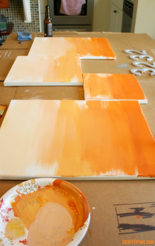
  3. Wooden Numbers: We used 5″ numbers in a sans serif font (For a modern look). I am just going to tell you now that I can not, in good conscience, give you an affiliate link to wooden numbers.  They are WAY cheaper at a local craft store.  Think $1-$2 per number before the usual 40-50% off coupon.
  4. Finish Nails: For hanging.
  5. Paper towels or an old rag

Step 1: Slap it On

Yep, just paint a layer of straight silver.  The wood is going to soak it up, so you might have to slap a couple of coats on.

First coat of paint to create a galvanized metal faux finish

Step 2: Mix and Match

Mix two different shades of silver, one lighter and one darker.  The easiest way to do this is take a whatever surface you are using to mix paint (cardboard, paper plate, actual palette) and make two small pools of silver paint.  Maybe 1-2″ in diameter.  Then added 2 drops of black in one and 4 drops of white in the other.  Mix and repeat if the colors are not about two shades off from the original.  Always remember paint dries slightly lighter!

Step 3: Pattern Time

I had a chance to look at some pressed galvanized metal containers while I was at the craft store picking up the wooden numbers. You might take a gander at the floral section and see if they have any galvanized metal buckets.  I always find faux finishing easier if I just saw a real life example.  In case you can not find a real life example here is a decent picture from Andrew Beeston of what we are trying to achieve:

Galvanized metal by Andrew Beeston from Flickr

The easiest way to get the angular light and dark patches is to dip your brush and use the flat side to press into the number.  I did the dark first and then went back and did the light color… Or maybe the other way around… It really does not matter except that you want hard edges and overlap, not a wet paint blend.

Second coat of paint to create a galvanized metal faux finish

Step 4: On No!  We don’t have pictures!

Yes, I failed to adequately document this last step, but it is sooooo easy.  Once your layers of paint have dried you can do this final step to soften the paint strokes of step three and give it a bit of a weathered look.  Pour a tiny bit of black paint out and mix it half and half with water.  Quickly brush the black all over the surface of your letter.  DO NOT PANIC, that you have just completely ruined your hard work.  Count to 10 and then wipe the black paint mostly off the surface of the letter.  It should just leave the finest glaze of darkness over the silver paint and knock off a little of the shine.  Remember that galvanized metal is not super shiny!

If, for some reason, the black stuck to much just repeat the above step but with a watery silver.  Remember that in faux finishing you can always just repaint any mistakes!

Completed faux finish for galvanized metal numbers

Step 5: Clean Fresh and Modern

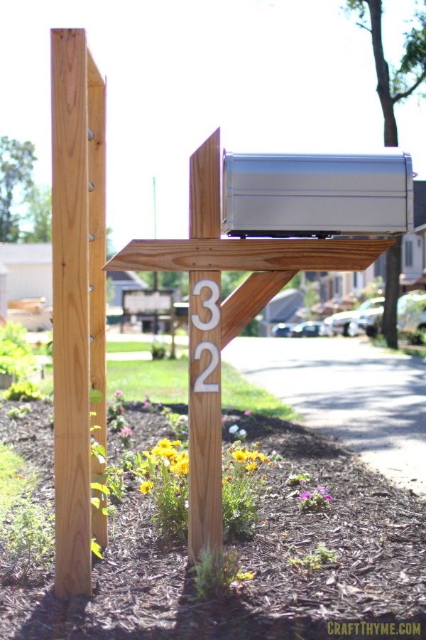
Since the numbers weigh next to nothing we were able to simply use a single nail to affix them to the mailbox and porch.  We choose to orient them in a straight vertical line to give a fresh, modern, vibe.

Replacing old tired numbers with faux metal finished street numbers.

Posted on 18 Comments

Modern Art: Concrete Style

Basic Orange Ombre Modern Art

I have a confession, I have never been a huge fan of modern art.  Having studied the theory and history behind a larger portion of 20th century art I have an appreciation for the merits… but the aesthetics… meh, not my thing.  Let me tell you, that was not a popular opinion in art school.  However I have a modern house, with industrial decor.  This has changed my viewpoint.  It takes a lot more work to integrate a classical oil portrait with our furnishings.  In fact, I felt like we needed some modern color in our rather neutral decor instead of some classical portraiture.

If you follow me on Pinterest (you should!) then you would have noted the love affair I am currently having with concrete.   I was reading a post about making a faux concrete counter top using a product called feather finish when I came up with the idea to make some modern art that would incorporate concrete finishes.  Color and concrete say what?!  Adam was confused when I tried to explain, but luckily he was the kind to just go with it.

A few Michael’s coupons and a trip to Home Depot later you have my DIY take on modern art.

Modern Art: Concrete Style

DIY modern art with concrete and gold leaf finishes

Supplies:

Canvases*

Gold Leaf Sheets* or a Gold Leaf Kit* (which includes the sizing and sealer)

Adhesive* (also called Sizing*)

Sealer*

Feather Finish* (HINT: Ardex has partnered with Henry to make a feather finish you can get at Home Depot, but here is my Amazon Affiliate link if you want the real thing shipped to your door)

Paints*

Brush Set*

Step One: Lay it out there

I picked out four pre-stretched canvases (we had some on hand and used a 40% off coupon to grab the others)  I laid them out for the space.  There is a fourth around the corner not shown in the above picture.  It is an awkward space, as the windows are not centered, so I used the two smaller canvases to fill out the area.  After deciding a layout I thought would look good I laid them out on the table in a similar, but closer, fashion.

Step Two: Om Om Om Ombre

I started with a base ombre of 4? colors.  I tend to just add paint mix and repeat so four is just a guess from looking at the finished product.  These particular colors were a base orange mixed with a touch of blue (to darken) and then yellow & white (to lighten).  I wanted a rather choppy look and did not bother to blend wet edges well.  If you want a very smooth ombre pre-mix all your colors so that you can blend in the wet edges.

Basic Orange Ombre Modern Art
You will note the awesome ‘professional’ equipment. Old cardboard box, paper plate, and beer. Also known as liquid crafting juice.  The super awesome layout sketch is that black scribble in the corner.  As you can see I love to fully plan out every brush stroke *sarcasm*

After the ombre was dry I brushed some black in feathery horizontal strokes.  This step is not shown, but really just consists of slapping some black on the canvas and moving it left and right till it feathers out at the edges.  You can practice on a piece of cardboard to figure out how much paint and pressure you need.

Step 3: Concrete Answers

I probably should have planned this step out better but I was just so damn excited to work with a new medium that I went right to mixing up the feather finish.  I followed the directions which were 2 parts mix to 1 part water.  I thought “Hey! Let’s make this easy, 1 cup water to 2 cups feather finish!”  Okay, huge mistake.  I made about 100 times more than I needed and it was quickly too thick to do what I wanted.  Check out the huge amount:

Feather finish by Henry and Ardex
Why yes that is a plastic spoon from a Christmas Party…. And I made this in June… Horde much?

So my suggesting is to just mix it the consistency of pancake batter.  You are using this for decoration not construction strength.  After re-mixing my feather finish I used a very old putty knife/multitool to feather the concrete on in bands that matched the style of the black paint.

Troweling on feather finish to make modern concrete art

Step 4: If You Like It Then You Better Put Some Gold On It

I took a step back and was really feeling the look, but wanted to tie some of the other room finishes into the final piece of art.  In comes the left over gold leaf I had from the lamp shade redo.  I thought it would tie that and the wallpapered bookcase into the open concept dining room.  I laid out the sizing (If you need gold leafing tips you can read more here) in the same pattern as the paint and concrete.  Once it had set I laid on the gold leaf and covered the areas with sealer to keep the leaf from tarnishing later.

Sizing in loose brush strokes to prep for gold leaf
If you wonder about the numbers in the back of the photos, I always figure why do one DIY project at a time when you can do two or three…

All in all, I love the color and texture mix.  It adds visual interest and ties the various spaces together in the first floor of our home.

Posted on 37 Comments

Building a Salvaged Wood Headboard

Salvaged wood headboard

I don’t know about you, but I’ve got a lot of wood.  After building string art projects for the boys, crafting a few salvaged wood coffee and side tables (post forthcoming), building a chicken coop capable of passing human occupancy code (also a future post), and saving some beautiful walnut hardwood flooring from the construction dumpster next door, I had managed filled both our porch and crawlspace with stacks of “one day I’ll do something with this” wood.  So while Brianna was in Seattle for her cousin’s college graduation, I figured it was finally time to get crafty!

The one room in our home where we have done absolutely NOTHING to make the space more “us” is our bedroom.  Shocker, right?  We spend a third of our day (and on a good day more than that) in this space, and it’s easily the blankest canvas outside of the stairwell – and even that has an industrial pop to it!  (Yes, another future Adam post)  For about a month following our move into the house, every time B and I would head to Target we’d find new bedding on clearance, and with Cartwheel, we’d walk away with a King set for around $25-$40.  So great, we’re got some funky lamps we made with Edison-style bulbs and a few sets of bedding.  Not a single other piece of hardware or decoration….  For two people that run a craft blog, this is a sacrilege!

King bed on blank wall
Lots of Wood + Empty Bedroom Wall Space = Prime Project Opportunity

Brianna and I had built our own bedframe prior to moving in, and it’s got a very rustic/industrial feel to it.  Big, stained, thick lumber with 3/4″ hex bolts to hold it together.  I wanted to stick with this look and feel and take it vertical.  Project decision: Headboard.

Industrial bed detail
Time to measure (or Google)!  A standard king bed is 76″ wide.  Great, one dimension down.  Up next, height.  This is really up to you.  For me, 36″ looked good.  I wanted the headboard to start at the top of the mattress, and for the space, 36″ up looked like a good place to stop.  Dimension two: Decided.  The end result was going to be a 76″ x 36″ headboard.  Now, to see what wood I had…

From building the chicken coop (or “palace” as many of our neighbors have proclaimed), I had a few scraps of 3/4″ sanded pine plywood left over.  Each piece of scrap was 48″ tall, but the widths of the pieces varied: 10.25″, 12.5″, 27.5″ and 36″.  Luck should have it that 12.5 + 26.5 + 36 = 76; a perfect backplane for a kind headboard!  I trimmed each piece to a height of 36″, laid them side by side, and began to lay out the pieces of scrap and salvaged wood in a perfectly haphazard mosaic arrangement.

Did I mention that a lot of the left over wood was painted, marred, chipped, slightly twisted, or naturally weathered?  I incorporated failed projects that were painted orange, blue and white, lumber I’d left out in the rain, thin lumber used as makeshift paint stands, and a few pieces of furniture grade wood purchased for endeavors never embarked upon as well.  Each piece of lumber was dimensionally 1″ (meaning an actual thickness of 3/4″).  I tried to mix textures and colors fairly evenly throughout, made cuts when necessary to fit the salvaged wood onto the backplane, and in the end came up with the following general layout:

Laying out salvaged wood for headboard
I’d kept Brianna in the dark about what I was doing while she was away.  In fact, I’d taunted her by telling her that she’d have to wait to see until she got back in 4 days.  After much begging for a preview, I finally gave in and sent her the above photo.  While she didn’t know what I was doing, she said loved the look of it already.  Great feedback for this stage of the project, but there was much more to do.

Next step?  Staining!

Using left over stains from the (to be written) Edison bulb light fixture project, I chose pieces out of the pictured layout to stain different colors.  I used Rust-Oleum  Dark Walnut and Minwax Early American stains and allowed for varying set times before wiping off the stain with a cotton rag.  When doing this, I wanted to make sure each piece of white wood got a good dose of color.  The end result?

Staining wood for salvaged headboard
Not too shabby, right?

Now remember that at this point nothing has been attached to the backplane. I’d gone back and forth between wood glue, liquid nails, and 1-1/4″ finishing nails to accomplish this goal. In the end, because I was terribly impatient, I opted for the physical nail option. So I pulled out my good old Porter Cable pancake air compressor and my 18-gauge brad nailer nail gun and got to work. The nice thing about finishing nails is that they have a relatively strong hold and leave virtually no visible holes with this type of wood finish. After 5 minutes of nailing, the headboard was complete. All that was left to do was move this baby upstairs and mount it!

Getting this thing upstairs, especially by myself, was quite the task. The finished product weighed in around 75lbs, and while that weight is more than manageable, at 76″ x 36″ it is terribly awkward to carry up a turning flight of stairs without hitting the first floor ceiling. Nevertheless, I finally made it to our bedroom.

Knowing how much the headboard weighed, I now had to find a means to mount this baby to the wall. After a bit of searching through different options, I chose to use an 18″ French Cleat* capable of supporting up to 200lbs. Why the extra support? With four boys, I envisioned at least one of them with a misfiring neuron doing pull ups on the headboard while playing on the bed. The french cleat cost us just under $9 from Lowe’s and was the only out-of-pocket expense for the whole project.

I followed the provided installation instructions for mounting the wall portion of the bracket while making sure to hit at least one stud in the process. In some cases you should be able to hit two studs over a span of 18″. The particular cleat we used came with a built in level thereby making installation a breeze! I then mounted the second part of the cleat to the headboard in the same horizontal position. Once everything was securely fastened, it was time to hang this sucker on the wall.

Salvaged wood headboard
Detail of a salvaged wood headboard
Not bad for $9 and a few hours effort IMO.  The headboard really transforms the space and finally adds the first bit of personal touch to what is really such an important room in our home.

Posted on 8 Comments

Bookcase Ideas: A Quick Makeover

detail of wallpapered bookcase

One of the neat features of the new house was a large built in bookcase, but it had the featureless contractor-white of a new house.  I needed some bookcase ideas and fast.  I wanted to make it pop, especially, before we filled it with items. I was in the process of trying to look through ideas for bookcase makeovers when I happened on the clearance section of Target.  Okay, Adam happened upon the clearance section of Target… BUT, I took to the idea immediately.  We decided to try some navy and gold peel and stick wallpaper.  It is removable and basically feels like a large vinyl sticker.

Bookcase Makeover

detail of wallpapered bookcase

Materials

  • Peel and stick wallpaper*
  • Straight Edge
  • Cutting Tool (I happened to have a nice rotary cutter and mat which made this process so much easier)

Before:

Just a boring plan bookcase…

Boring white bookcase transformed with peel and stick wallpaper

Quick Directions

Measure, cut, and stick.

Except it needs a little more finesse than that.  First, this was a custom bookcase.  Guess what that means?! No section was the same size…  I carefully measured the different sections and then calculated the best cuts so I did not have to waste more of the paper than needed.  Even on sale it is not what I consider cheap!

My first section I left a little edge on the bottom and side thinking it would give a better fit if I trimmed it with an exacto knife after sticking it down.  Wrong, wrong, wrong.  It made it near impossible to get the sticker all the way to back of the shelf, then it was hard to get it smoothly applied (Use a credit card.  The enclosed tool was useless… I used to place decals for a living and you need something with a little flex), then when I trimmed the edge it was jagged.  I made sure to just measure carefully and trim accordingly for all other sections.

If you are not used to applying decals I will give you a tip.  Apply from the top middle and sweep out and downward to the left and right.  Occasionally, if you are matching patterns you will have to start on once side.  In those cases try to move in smooth outward motions from the area you start at.  Small air bubbles will usually lay down in a couple of days.  I did not have to do this for these small sections, but if you are applying a giant decal and, say, have a large group from the corporate office coming to check your display, and maybe have one giant ass air bubble in the middle and no extra decals…. Well you can take a very small needle and poke a tiny hole and work the air out getting it fairly flat.

After you have all the sections stuck, step back, admire your beautiful bookcase, and start arguing over what books and art should fill the shelves.

After:

Filled with items from our travels, our favorite books (note the fascination with the Dark Tower), and some elegant accessories.  I think the navy and gold wallpaper gives the bookcase some focus without being overly busy.

Boring white bookcase transformed with peel and stick wallpaper

Posted on 11 Comments

Pantry Door Ideas: A Quick Makeover

Navy blue door with orange accents

This is the first new construction house I have lived in.  Yea for 90 degree angles, boo for lack of character and patina.  Working to remedy the contractor white of the place led to a pantry door idea.  I thought I would give it a quick makeover with some navy blue blue paint.  Recalling an old Martha Stewart Article on doors, I thought it might be fun to also give the edge a pop. We had a bright orange left from painting an accent wall in the guest bathroom.  Since the navy and orange accents flowed through the entire downstairs it seemed like a good fit.

Pantry Door Ideas: Make Over Time!

Materials:

  • Paint
  • Sponge Roller
  • FrogTape :* Yes it is expensive, yes it is a name brand, yes it is worth every single cent, and no sadly frog tape is NOT paying me to say that.
Pantry Door Idea: Makeover Time
Just a plain pantry door in need of a little umph.  You can see the accent wall we added in the bathroom.

Quick Directions:

Paint the front of the door and then paint the edge…  So sarcasm aside, it is close to that easy.

First, I carefully taped the white edge, wisely realizing that it would take a number of coats of orange to cover any navy that smudges. NOT!

Of course I didn’t tape the edge the first time around.  But, I will get to that in a bit. I really wanted to take the door off the hinges, but it was impossible to get the last one loose.  Because of that I had to work really fast to not make roller marks in the glossy navy paint while only using the smallest amount of paint possible so it didn’t run down the vertical surface.  I failed, not once, not twice, but three coats.  Every evening the light would shine off the marks roller marks where I had hit an area that dried to quickly.  Ugh.

The only benefit of making that mistake is I had plenty of time to correct the door edge.  What a P.I.T.A.  I hate taping. Loath it.  However, after the first coat of orange I realized nothing short of taping a nice clean edge was going to give the effect I wanted.  I wanted the blue to show when closed and the orange to pop only when opening the door. Plus I wanted the edge to have a nice straight line.  The door had a slight bevel that was not noticeable until you ran a roller over it and smear blue or orange the wrong direction.  Seriously!  Take the time to tape this project. I was so much happier with the details once it was complete.

Navy blue door with orange accents
Just a nice navy blue door.
Navy blue door with orange accent
The kapow! Pop of orange edge.